
Color Editing Inspired by James Popsys
If there is one thing in photography that I find really challenging, then it is color editing. Probably this is because the perception of color depends on so many characteristics of a photograph — like color palette, color temperature, exposure, and contrast — that things become confusing very quickly. Fortunately, I’m gradually finding my way around, thanks to some inspiring photographers on the web who are generous enough to share bits of their editing process.
One such photographer is James Popsys, whose mix of landscape and street photography is just as refreshing as his editing style. I’ve been fascinated by his photography and editing for quite a while now and gradually figured out his basic approach. Doing much of his photography in the lush landscapes of Wales, Popsys’ color editing tends to focus on greens, yellows, and oranges. As far as I can tell, he shifts these colors towards the warmer part of the color spectrum. Yellows, oranges, and reds are shifted towards each other and get a slight boost of both saturation and lightness. Greens, often dominant in landscape photographs, are slightly shifted towards yellow and substantially toned down by reducing both their saturation and lightness. Cyans and blues are toned down as well by reducing their saturation — more so for blues, which are pushed towards cyan at the same time. Magentas and pinks, finally, seem to be left untouched. The table below gives a summary of these basic edits.

The color editing scheme that I initially derived from the photography of James Popsys. Hue indicates a shift towards the color mentioned. Saturation and lightness indicate a slight or substantial value change in the indicated direction (plus or minus signs). Empty cells indicate that there are no changes. I used the basic color editor of Capture One for these edits, which is comparable to the HSL panel in Lightroom.
The result is a very attractive, somewhat subdued, but warm color scheme, which obviously fits the Welsh landscapes very well because of the many greens, yellows, and oranges. It also injects life into photos that were shot on gray days, which must be abundant in this part of the world. It actually works for all lighting conditions provided that exposure and white balance are adjusted correctly.
More recently, I realized that Popsys essentially uses color editing to add contrast to a photo. That is, he makes some colors stand out relative to neighboring colors by adjusting their relative lightness. Although color contrast can also be increased by adjusting hue and saturation, Popsys primarily increases luminosity contrast between dominant colors in the scene, for example, by darkening the greens while lightening the yellows. This means that the above color editing scheme isn’t a fixed recipe, but just a possible solution. The actual editing depends on the color palette of each individual photograph. Based on that, it needs to be determined which colors to emphasize and which other ones to tone down.
Popsys’ editing style is all about color contrast.
If I were a Lightroom user, I would definitely try out Popsys’ presets, but I believe that even with his presets available, tweaking remains essential because no photo is the same. I have applied variations of the above color editing scheme to several of my recent edits in Capture One, my current RAW editor: see the three examples below. Although I was not yet fully aware that Popsys’ editing style essentially is all about color contrast, I believe that these edits match his style quite well.
All in all, it was fun trying to reverse-engineer the color editing of one of my favorite photographers on the web. I think that borrowing these bits and pieces from other photographers is a great way to learn and eventually develop your own editing style.
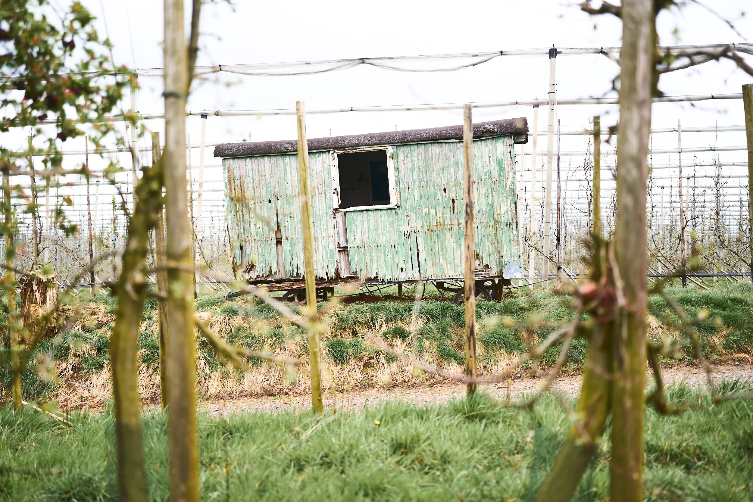
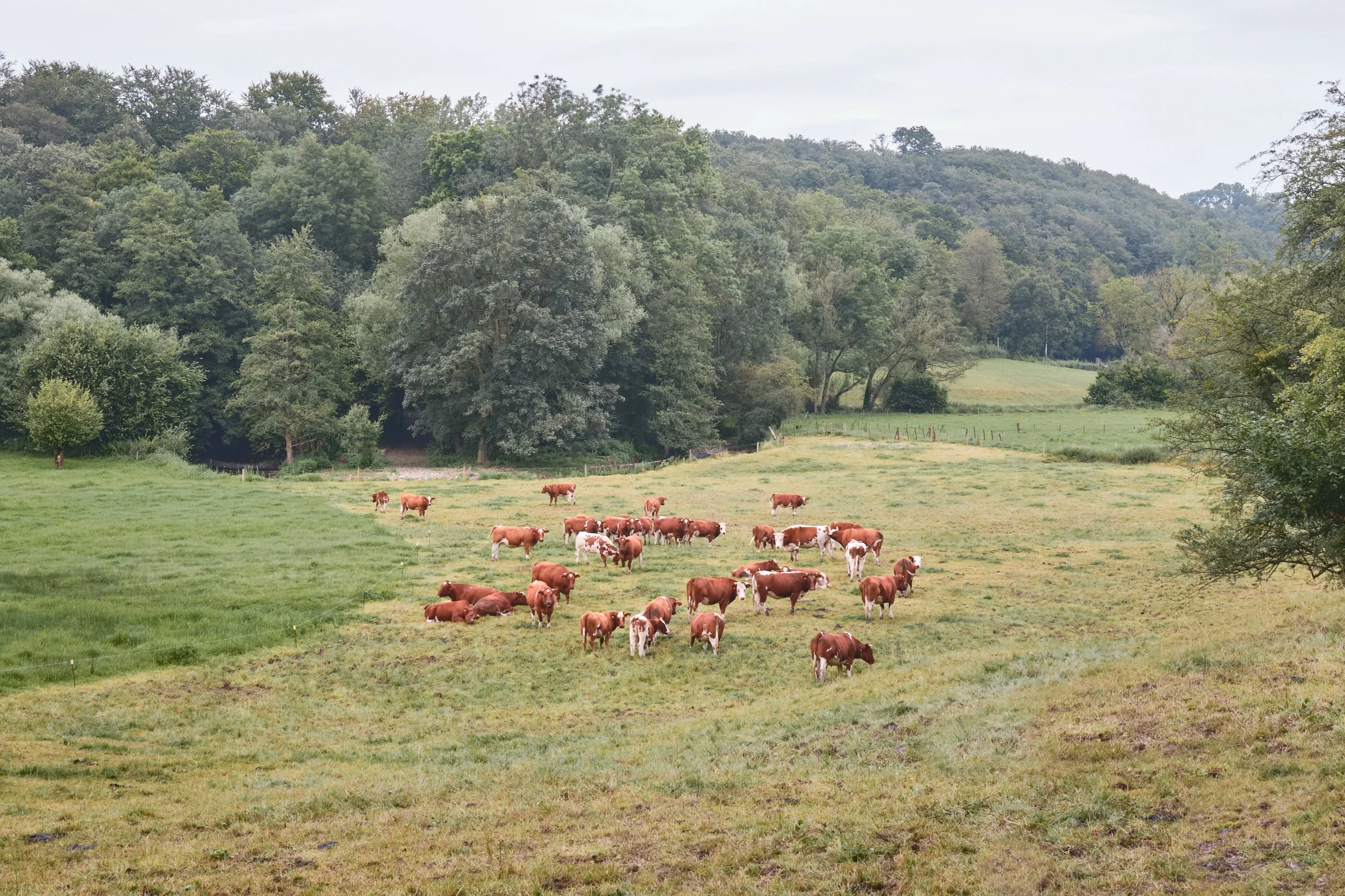

Some of my recent color edits inspired by James Popsys.